
The Duck Curve: Why Solar Generation and Evening Demand Differ
Daytime solar changes grid net demand. Household load timing is related but is a different measurement.
Daytime solar changes grid net demand. Household load timing is related but is a different measurement.
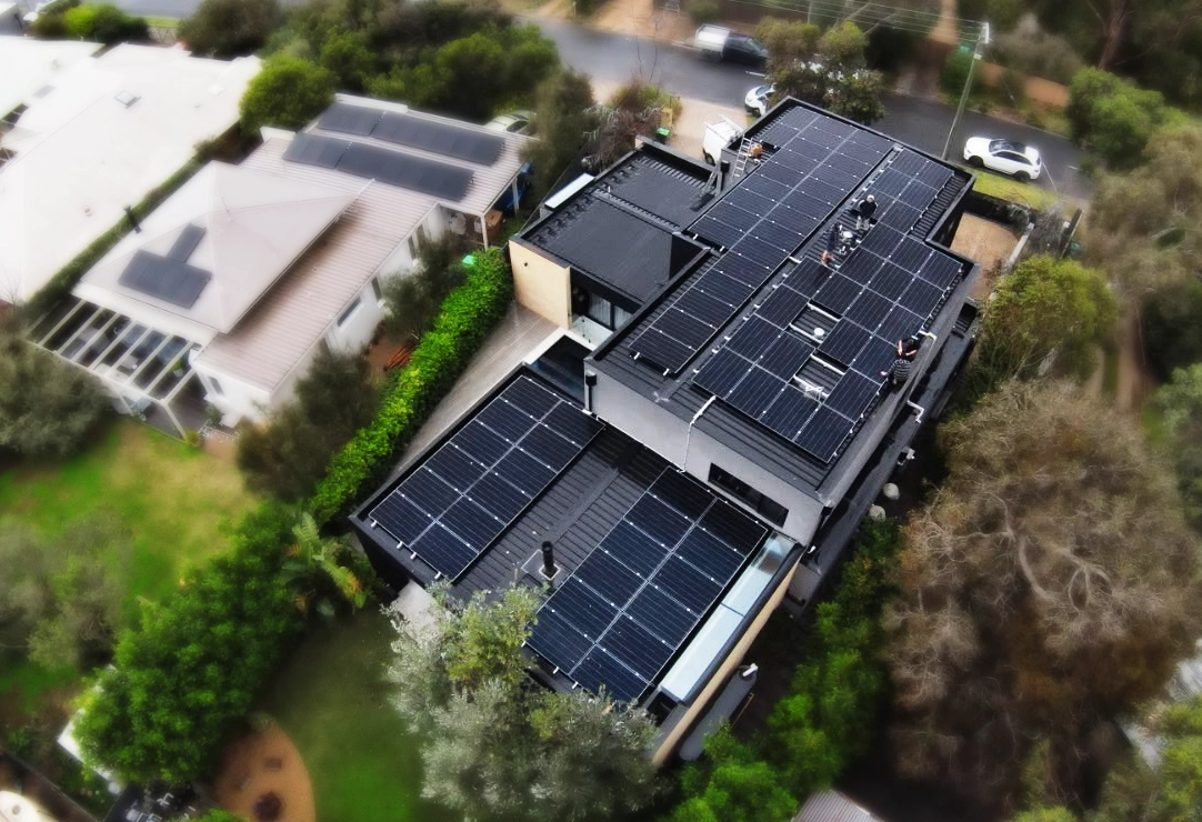
The “duck curve” describes a pattern in a power system’s net demand: daytime solar reduces the demand that other grid resources must meet, followed by a rise as solar output falls and evening demand remains.
The duck curve describes the shape of net demand on an electricity system with substantial daytime solar. Remaining demand falls around midday, then rises as solar output declines and other demand changes later in the day.
Large batteries can absorb energy and supply it later, affecting electricity-system operation. A household still pays under its retail plan, including applicable usage rates, time periods and supply charges.
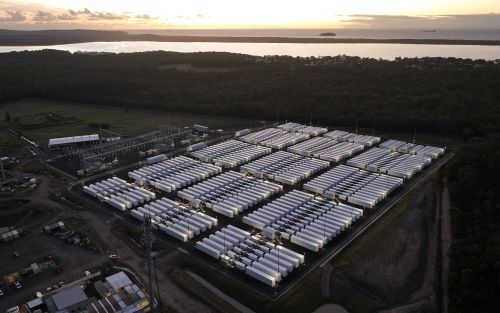
Solar without a plan for the evening creates a familiar pattern:
Cooking, heating and other evening loads can occur when solar output is low. The household design should compare load timing, efficiency and storage options rather than assume daytime production alone meets evening demand.
Under a time-of-use tariff, evening imports may cost more than daytime imports. Compare that price with the credit for exported solar. The difference helps assess load shifting and storage, alongside their costs and losses.
A household can generate plenty of electricity during the day and still buy electricity in the evening. Compare household consumption, imports and exports alongside solar generation to see when energy is needed. This household profile is distinct from the grid-wide demand pattern shown by the duck curve.
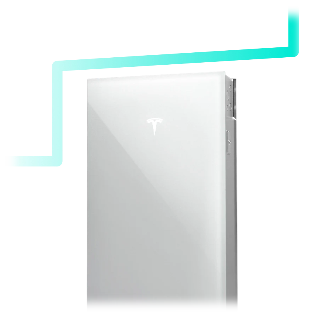
Compare the available generation, flexible appliance schedules and any proposed storage as parts of the household plan.
Solar production varies through the day and with weather. Electricity demand also changes. When substantial daytime solar is present, the remaining demand for other supply can fall, then increase quickly later in the day.
A chart should say what region and day it represents and whether it shows measured or conceptual data. A hand-drawn illustration is useful for explanation, but should not be labelled as an actual AEMO measurement.
Contact Lightning Energy to discuss the options for your property and electricity use.
Available times
Book a consultation and we'll map solar, storage, hot water, and the rebates around your bills and your goals.
Question 1 of 6